The Hub
A one-stop safety resource app operated by SMU aware for SMU community.

OVERVIEW
Description
SMU Aware is the communication and service team that provides SMU students and faculty/staff with safety information. My team had identified an opportunity to improve and redesign the current third-party safety app, "Live Safe," operated by SMU Aware, for the SMU community as a one-stop hub platform that provides comprehensive safety information.
Problem
The use of multiple communication platforms by SMU Aware makes it difficult for the SMU community to access safety information. To address this issue, we aimed to create a university-branded single platform that serves as a one-stop hub for all safety planning, preparedness, and communications for the SMU community.
Goal
I started this project by the goal with our team by posing the question
“How might we help SMU Aware better communicate emergency and safety resources to the SMU community through a one-stop single platform?”
Project Type
Client Project
Scope
User Research, Product Strategy, UI/UX Design, Branding
Team
Led team of 4
Duration
12 weeks (Fall 2022)
RESEARCH
User Survey
We conducted a survey with 100 SMU students and faculty/staff to holistically understand which existing SMU communication platform was the most effective to be used as a one-stop hub for safety and emergency.
80% of users pointed out the app has the most potential to become a hub for safety resources and information.
Competitive Analysis
We used competitive analysis with four different app platforms that are very actively used in peer universities. We discovered that 42% of peer universities use a university-branded safety app to inform and communicate safety. The complete analysis can be viewed here.
Redefined Goal
We learned that the current Live-Safe App was the most successful opportunity to access all information regarding emergencies and safety. So we redefined the next step how might we question to narrow down our goal.
We can help SMU Aware better communicate emergency and safety resources to the SMU community by reframing and improving the current safety app as a one-stop hub for safety resources.

User Interview
We interviewed 12 graduate students who largely represent the SMU community and conduct in-depth interviews that could help us find the opportunity to improve the current safety app to their needs.
SYNTHESIS
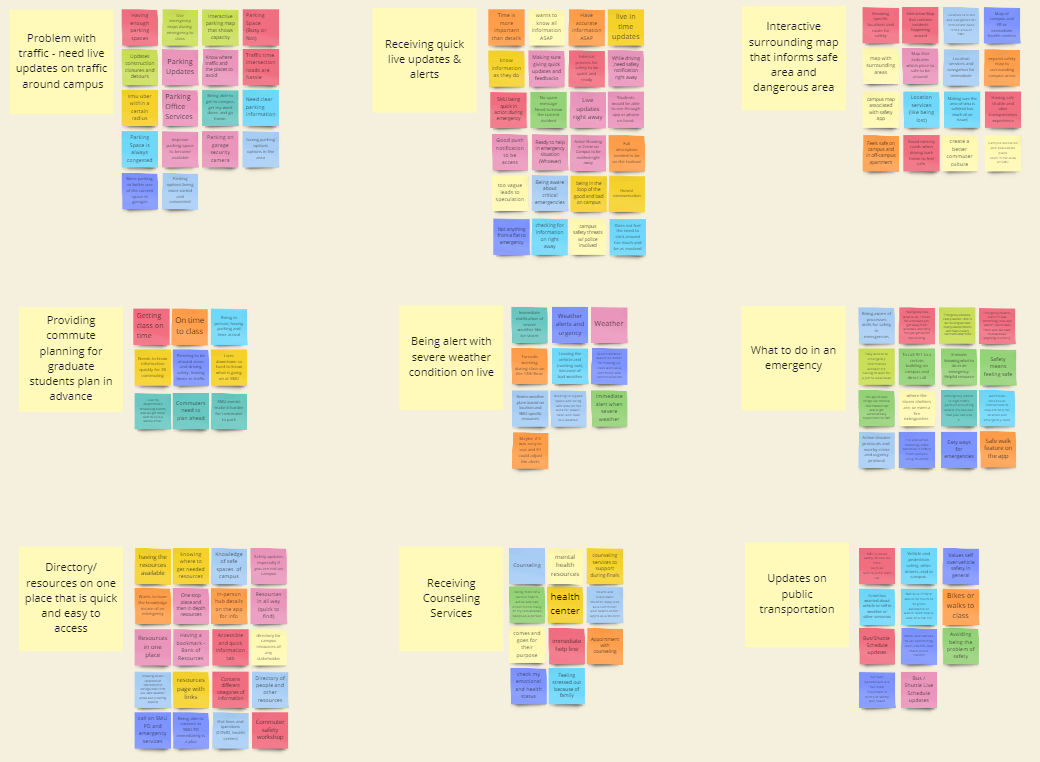
Affinity Mapping
After conducting the interview, we aggregated all our findings into an affinity map in order to better understand graduate students’ pain points, needs, goals, and motivation regarding using SMU Aware safety and the current safety app.
Key Insights
Through our interviews, competitive analysis, survey, and literature review, we covered a range of pain points and needs that graduate students experience into several key findings.

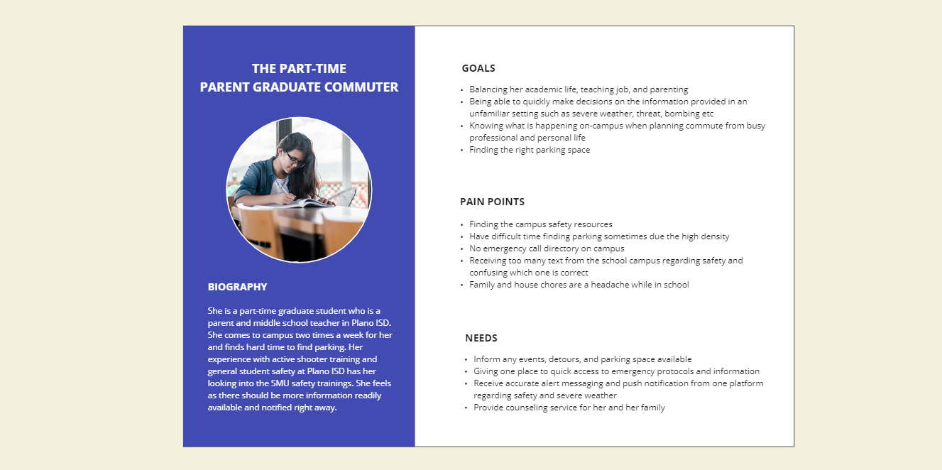
Persona
In order to synthesize our findings and identify emerging user patterns, we created personas for graduate students to empathize with and design our three user groups better.


IDEATION
Group Featuring
I have led this ideation process. First, we brainstormed our new potential features that can be incorporated into the current Live Safe based on our three persona groups. We use a hierarchy structure, from the high to the low priority features to categorize into groups based on our synthesis.

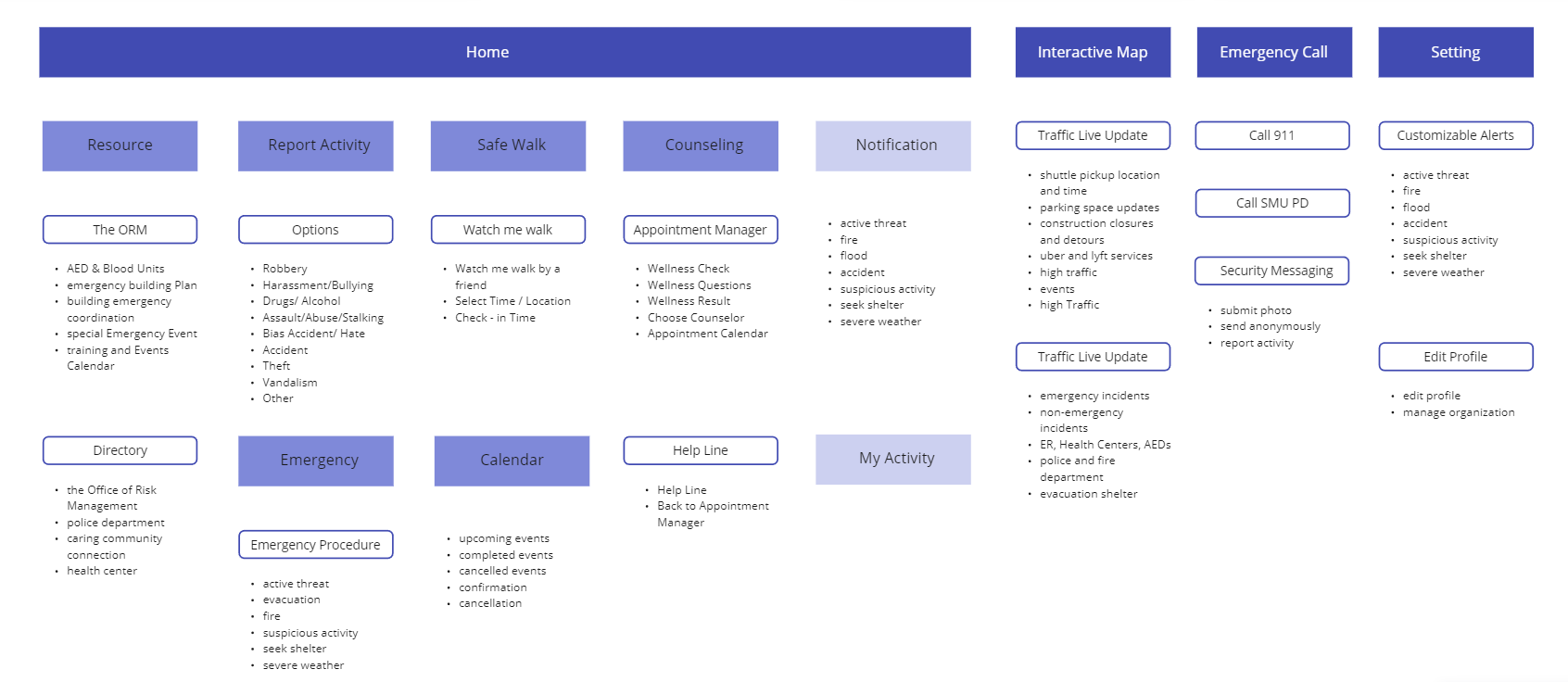
User Flow
To have a better understanding of the flow, we made four user flows based on the essential features that commuter graduates need. The flow helped us to the perspective of the users to navigate through the app.


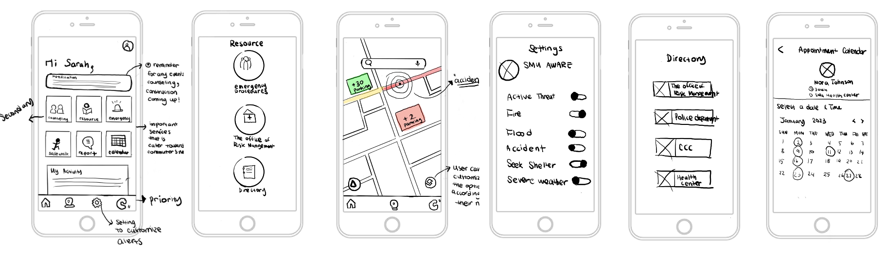
Sketches
We sketched out the screens to visualize the workflow. During this process, we made various versions of the screens to brainstorm different layouts.
PROTOTYPE
Wireframe
We created low-fidelity prototypes to better understand our ideation in digital form. We went back to our persona and user flow to align the order of screens in the design solution upon constant testing and exploration of various flows.
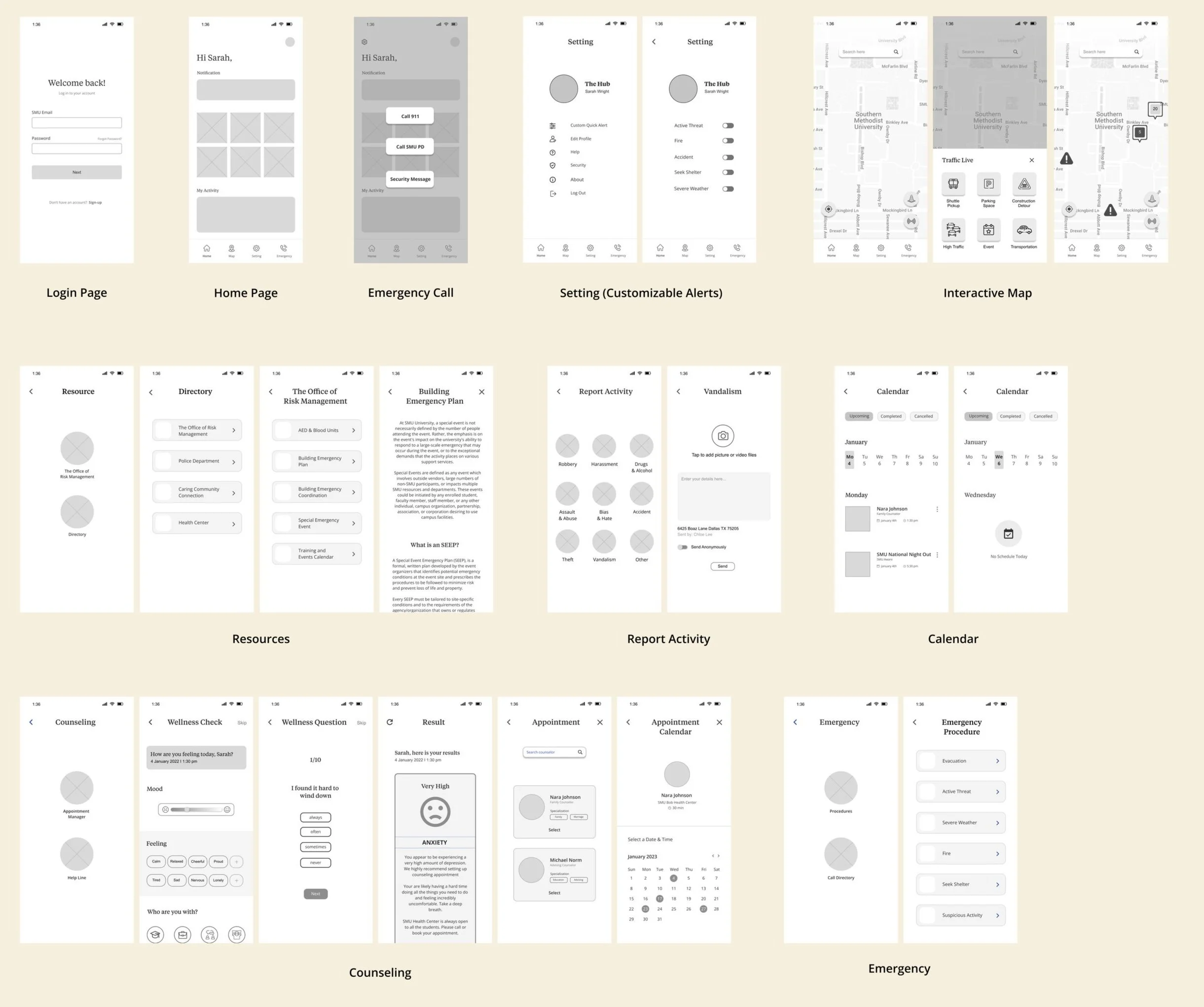
Style Guide and Design System
We chose our UI system focusing on accessibility and SMU primary branding colors. We tested the colors based on the contrast checker to be inclusive to all the users. Utilizing all the brand colors made the screen not accessible and uncomfortable.

Usability Testing
We tested a detailed scenario based on our personas with users to ensure the usability of our workflows. The goals of usability testing were to understand the flow of the overall app, uncover usability problems, and navigate to complete tasks.

Issue 1
Redundant and overlapping features
Summary
confused about two emergency features
too many features overlapped
struggle to find or click on the right feature
Solution
remove my activity and move the calendar as sub-feature
place emergency procedure information under the resource
removed the reminder and placed a notification

Issue 2
Uncomfortable and confusing buttons
Summary
doesn’t show which one is urgent
visually uncomfortable
Solution
create a visual hierarchy of emergency features
remove the transparent dark background
FINAL DESIGN
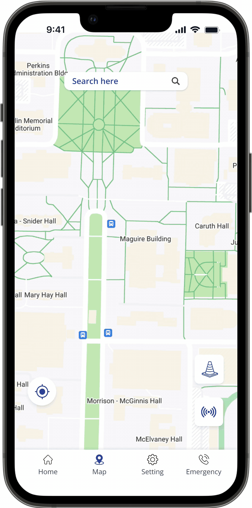
An interactive map that help users to search traffic live updates and surroundings for safety.
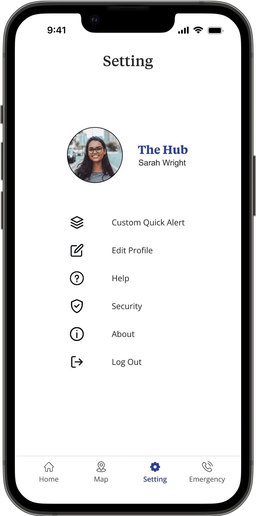
Customizable alerts allow users to configure alerts according to their preferences.
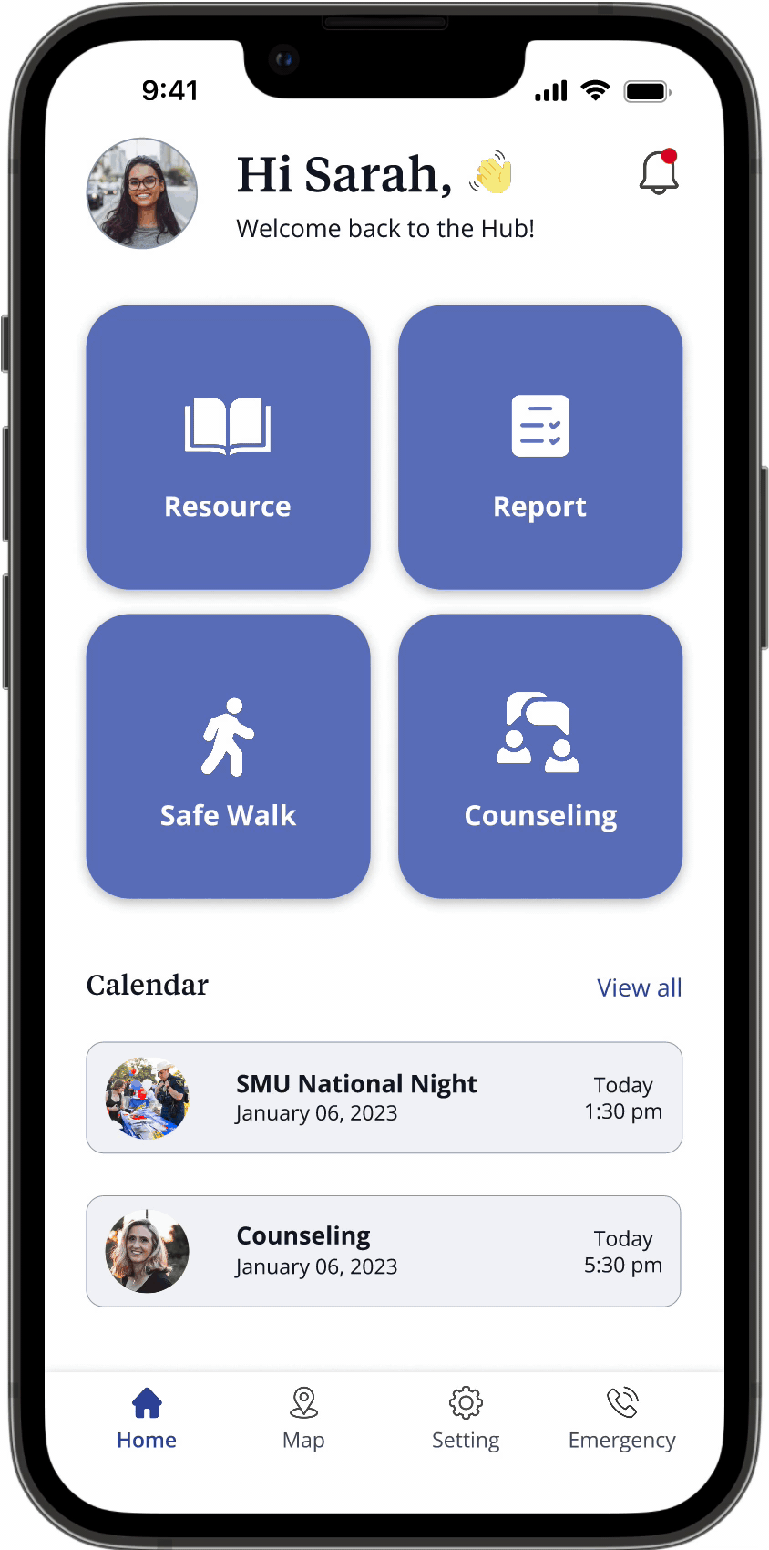
One-stop place to find all the safety resources for the directory, emergency procedure and etc.
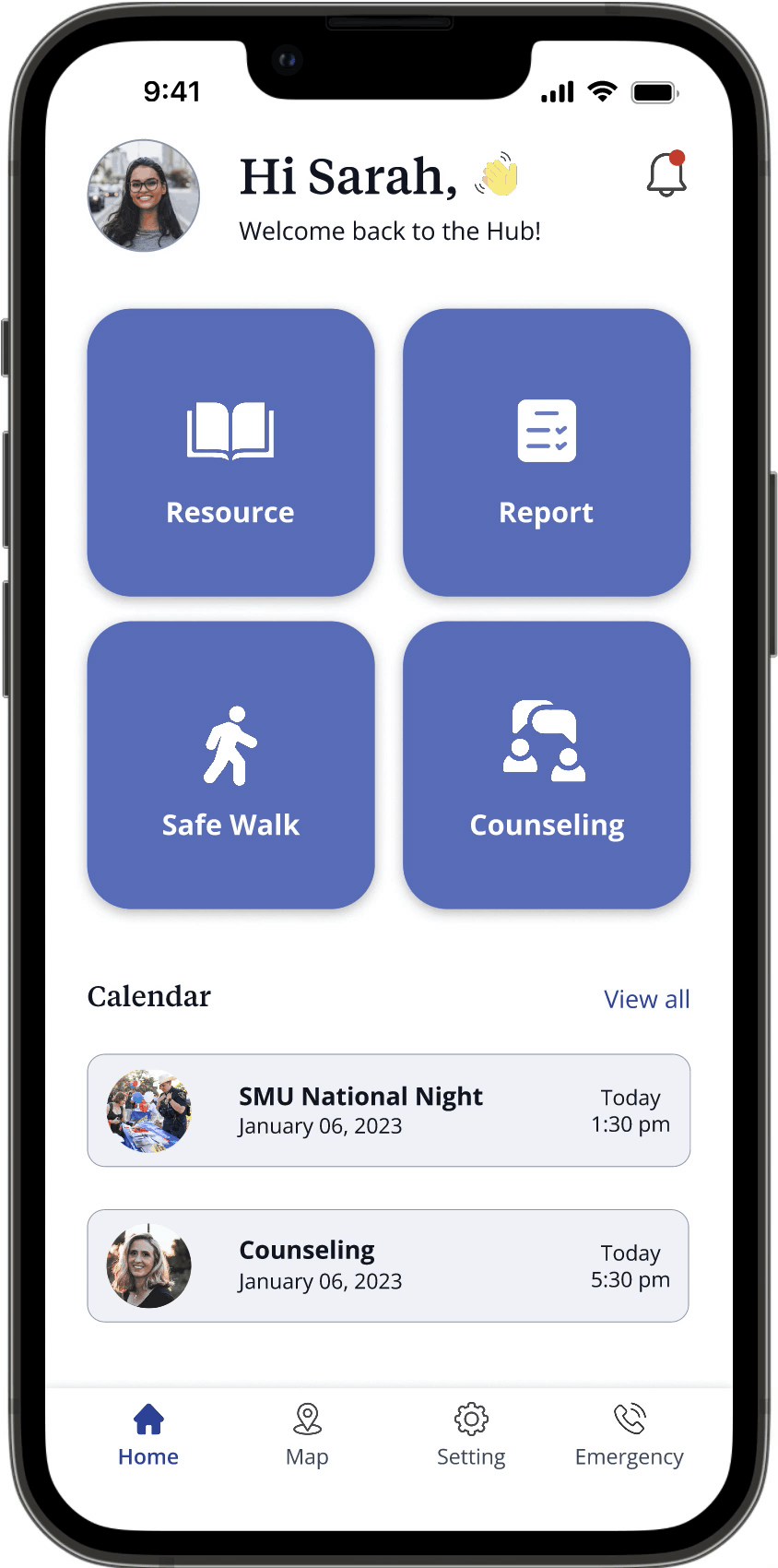
Counseling service that helps users assess their wellness and book counseling appointments.
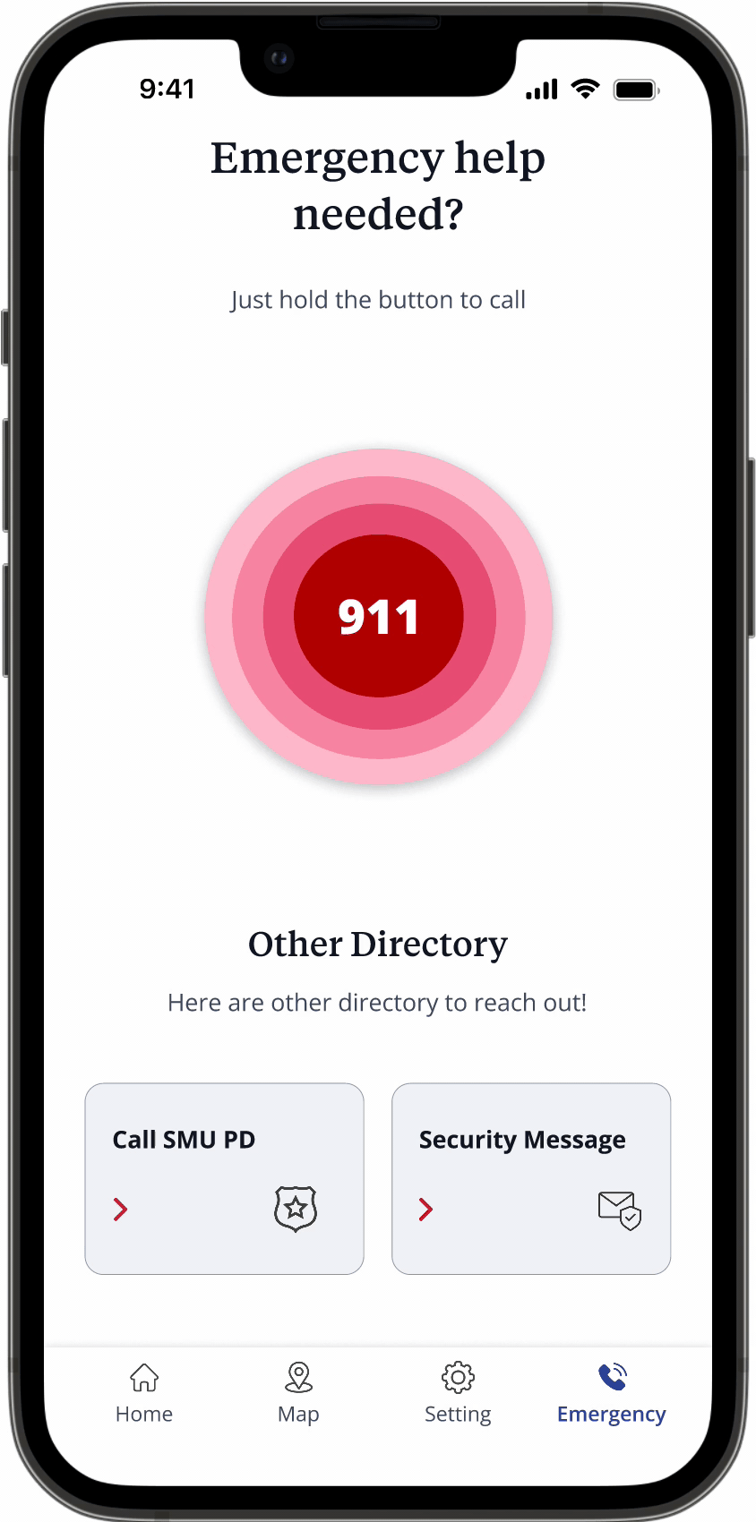
Emergency protocol that users can access to immediately to call and message.
Final Thoughts
The Hub received positive feedback from our clients and stakeholders. This was my first project as a lead and it presented a challenge in terms of narrowing down the scope. I had to define the areas of improvement for the SMU Aware platforms and identify the focused group that represents the larger SMU community. Despite the difficulties, this project pushed me to be more creative during the ideation process and to conduct a more comprehensive research. If our team had more time, I would have dedicated it to improving the interaction of each feature through more usability testing and conducting additional interviews.